A creative studio focused on brand strategy,
visual identity, CGI, key art, packaging, and film.
MIMAKI
- CLIENT:
- TOKAI YAMANI
- ROLE:
-
- Visual Identity
- Package Design
- DATE:
- 2020~
MIMAKI is a premium pickled plum brand that uses Nanko plums sourced from Minabe, Kishu. It utilizes carefully selected pickled plums chosen by discerning plum wholesalers and has gained a considerable following. The project started in 2020 based on the brand owner's request to create a unique pickled plum brand. The art direction encompasses the development of the brand logo and various package designs.
Brand Research
The concept of creating a "unique pickled plum brand" was explored by conducting research on other companies in the same industry. It was discovered that most pickled plum packages emphasized a traditional Japanese image with handwritten product names and illustrations. However, it was realized that by following a similar traditional design approach, MIMAKI would risk blending in with competing products and reduce the chances of attracting attention as a newcomer. Consequently, MIMAKI decided to eliminate the traditional Japanese image in order to differentiate itself from other brands.
Visual Identity
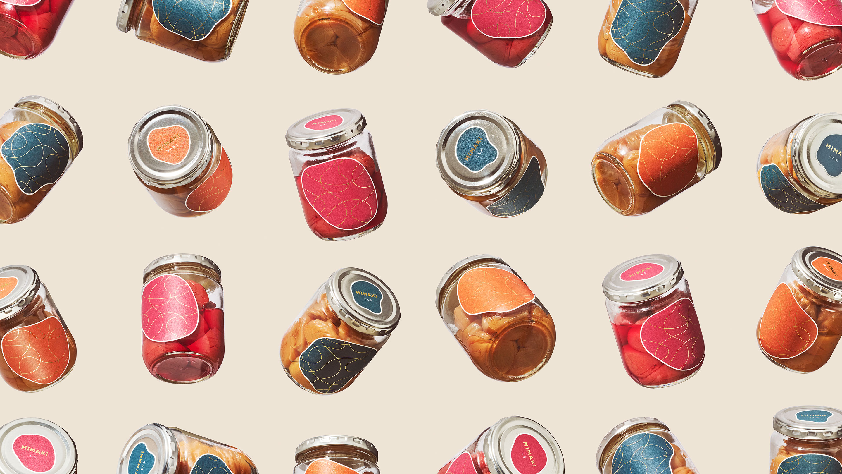
Recognizing that package design plays a crucial role in the field of food packaging, the same thought was given to building the visual identity and package designs. In this field, the logo is overwhelmingly used in conjunction with package layouts rather than being used independently. Therefore, it was deemed necessary to proceed with designing the logo and packages simultaneously to avoid potential inconveniences that may arise from creating the logo first. Through design work and extensive testing, an idea emerged to represent pickled plums through abstract geometric shapes, using the mark directly as the label on the bottle. Since there were three predetermined flavors, three variations of the mark were created with different colors and shapes, allowing for easy differentiation between flavors. This design was born as a result of developing the visual identity and package design in parallel.
Product Expansion
After finalizing the bottle design, attention was turned to designing the gift boxes. As the bottle design adopted a vibrant tone, it was believed that the gift boxes should have an extremely simple design. The approach chosen was to use a subtly textured white paper with the logo type embossed in gold foil. Additionally, a wrapping paper featuring three-color symbol marks, discreetly covering the gold foil, was wrapped around the box. This simple design aims to create a contrast with the lively bottle design when the box is opened, providing an enjoyable unboxing experience. The gift boxes are available in 2-piece and 3-piece sets, and cost considerations were taken into account by reusing the wrapping paper and foil plate.
Initially, MIMAKI started with bottled pickled plums, but its popularity gradually spread through word-of-mouth, leading to the expansion of the product line to include larger sizes and dried plums. MIMAKI has also garnered a significant number of health-conscious fans overseas, and the brand's "unique and cute pickled plum" concept, along with its package design, has received high praise. As a result, MIMAKI's recognition is gradually expanding internationally, with plans for upcoming sales in New York and other regions.
CREDITS:
- Directed by ZYLA
- Art Direction and Design:
- Hiroki Fujimaki
- Creative Direction:
- Kohki Shiraishi (KAFUL)