A creative studio focused on brand strategy,
visual identity, CGI, key art, packaging, and film.
BETTER DAY(S) PRIORITY
- CLIENT:
- BETTER DAY(S) PRIORITY
- ROLE:
-
- Branding
- Visual Identity
- Package Design
- Web Design
- DATE:
- 08 DEC 2022
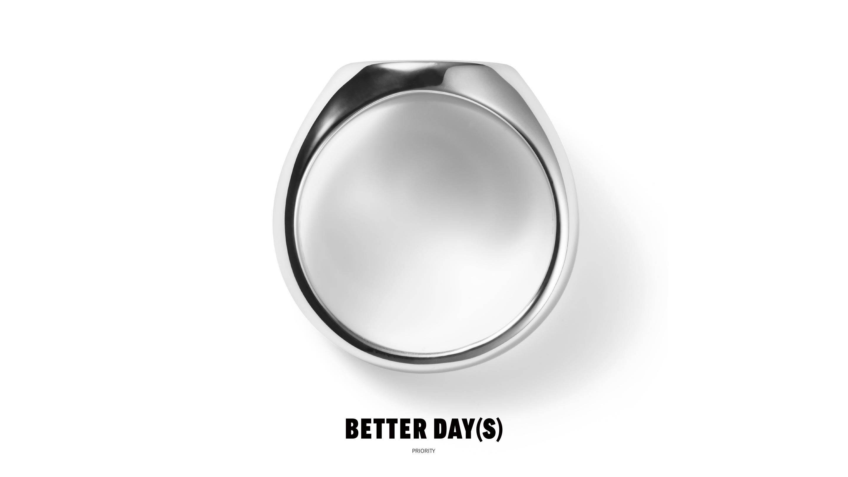
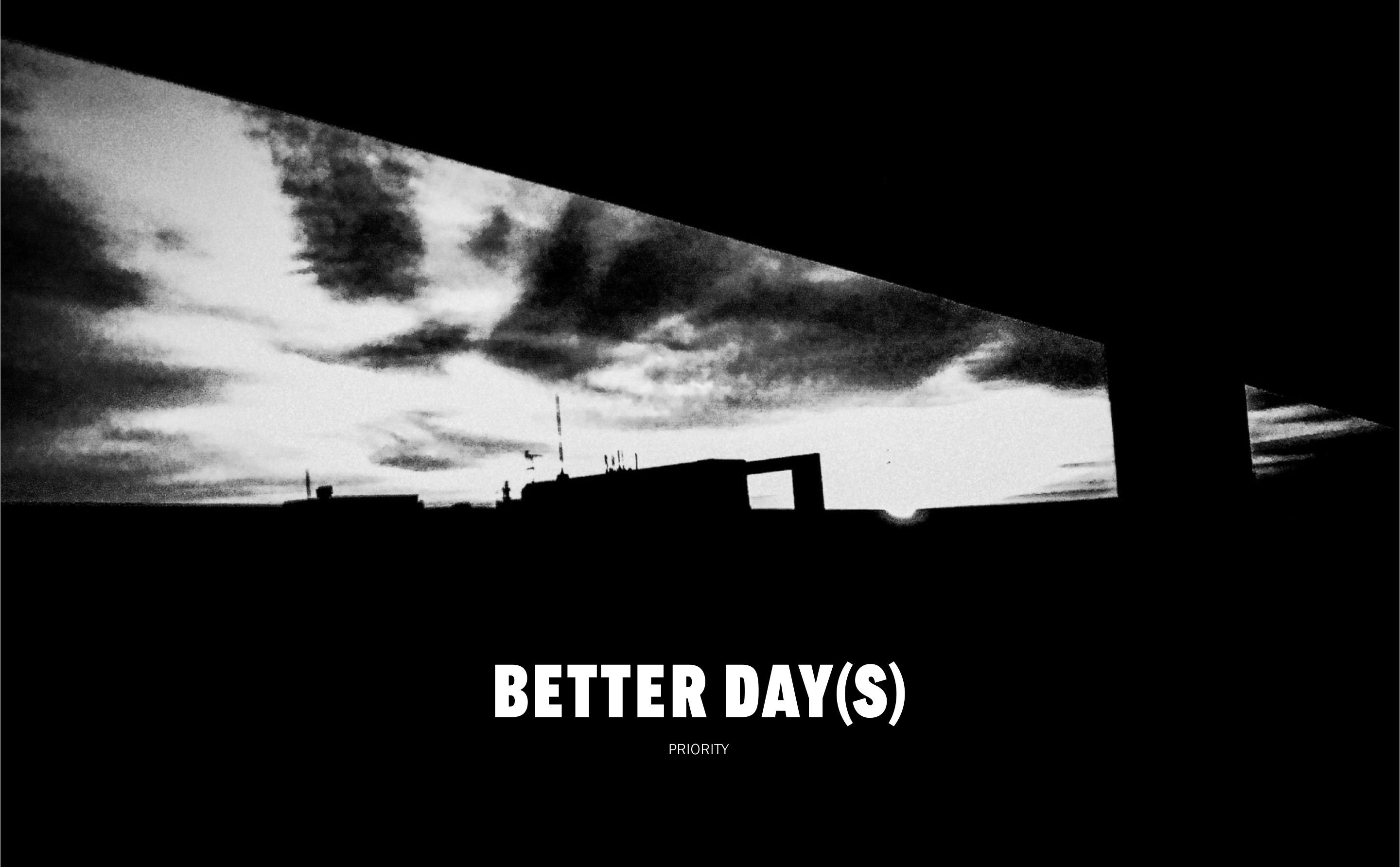
BETTER DAY(S) PRIORITY is a jewelry brand created by fashion director Kohji Yukisada, established in 2022. Yukisada expresses his desire for the brand to serve as a catalyst for reevaluating beauty consciousness and to be a presence accompanying people on their good days. He also emphasizes the importance of choosing what is important to oneself, free from existing frameworks. ZYLA has been involved as the art director, working on everything from the logo and packaging to the website and product photography for this brand.

Brand Philosophy
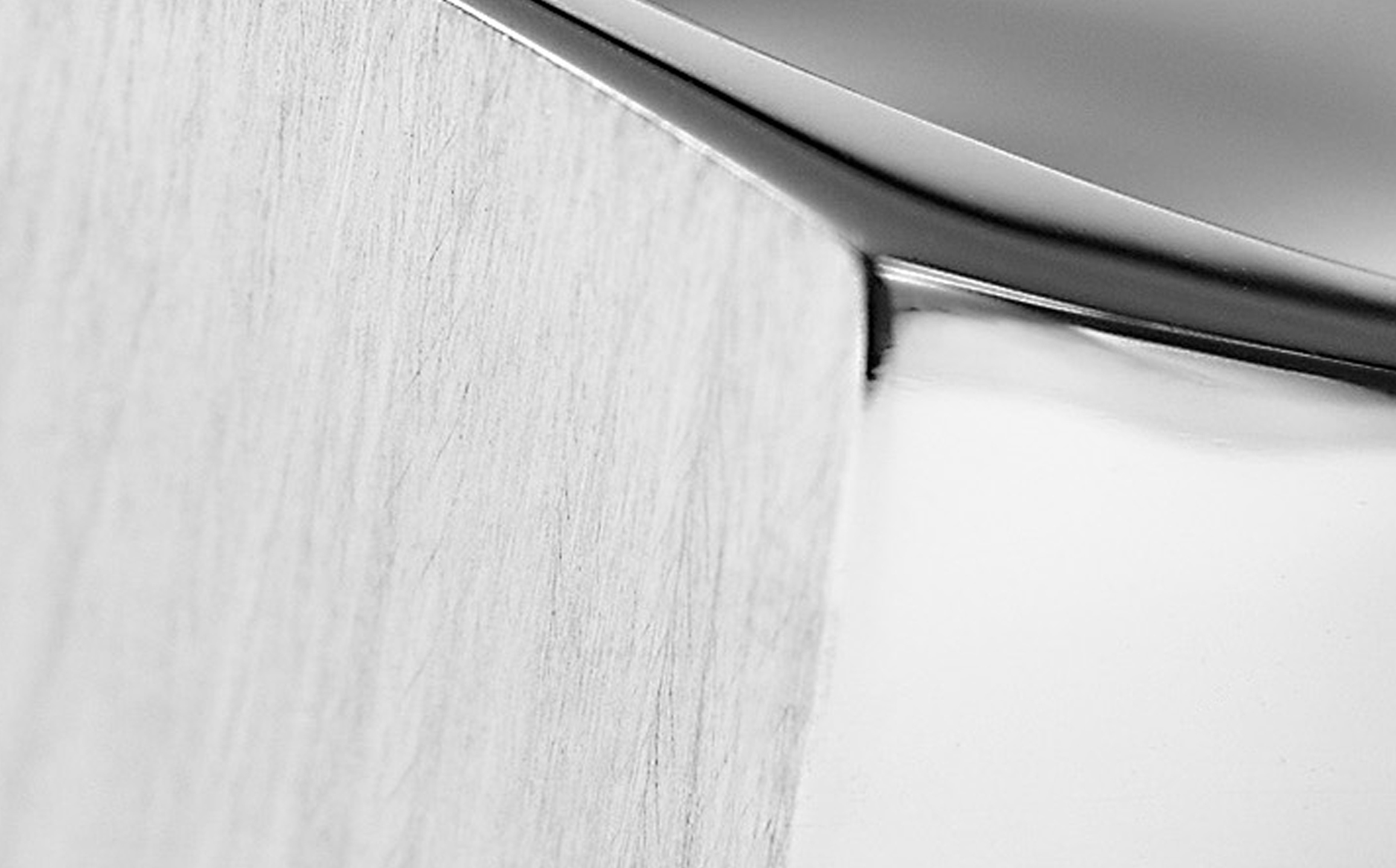
BETTER DAY(S) PRIORITY embraces five core words in its brand philosophy: "no boundary," "less is more," "shu-ha-ri," "anonymity," and "inherit." These words form the foundation of the brand and guide the overall design. The brand seeks simplicity and minimalism, occasionally incorporating subtle variations. It emphasizes avoiding extremes, striking a balance between doing too much and doing too little. This approach shapes the worldview of BETTER DAY(S) PRIORITY.
Logo Design
From the beginning, the BETTER DAY(S) creative team agreed that an ornate and decorative logo design was unnecessary. This aligns with the brand philosophy and also considers the envisioned future usage scenarios. The logo is not limited to standalone use but is also intended to be placed on product photos and visuals. Therefore, the design aimed for simplicity that doesn't interfere with the photographs, ensuring that even in a small size, the logo remains readable and impactful. Multiple iterations were tested to determine the optimal weight and kerning.
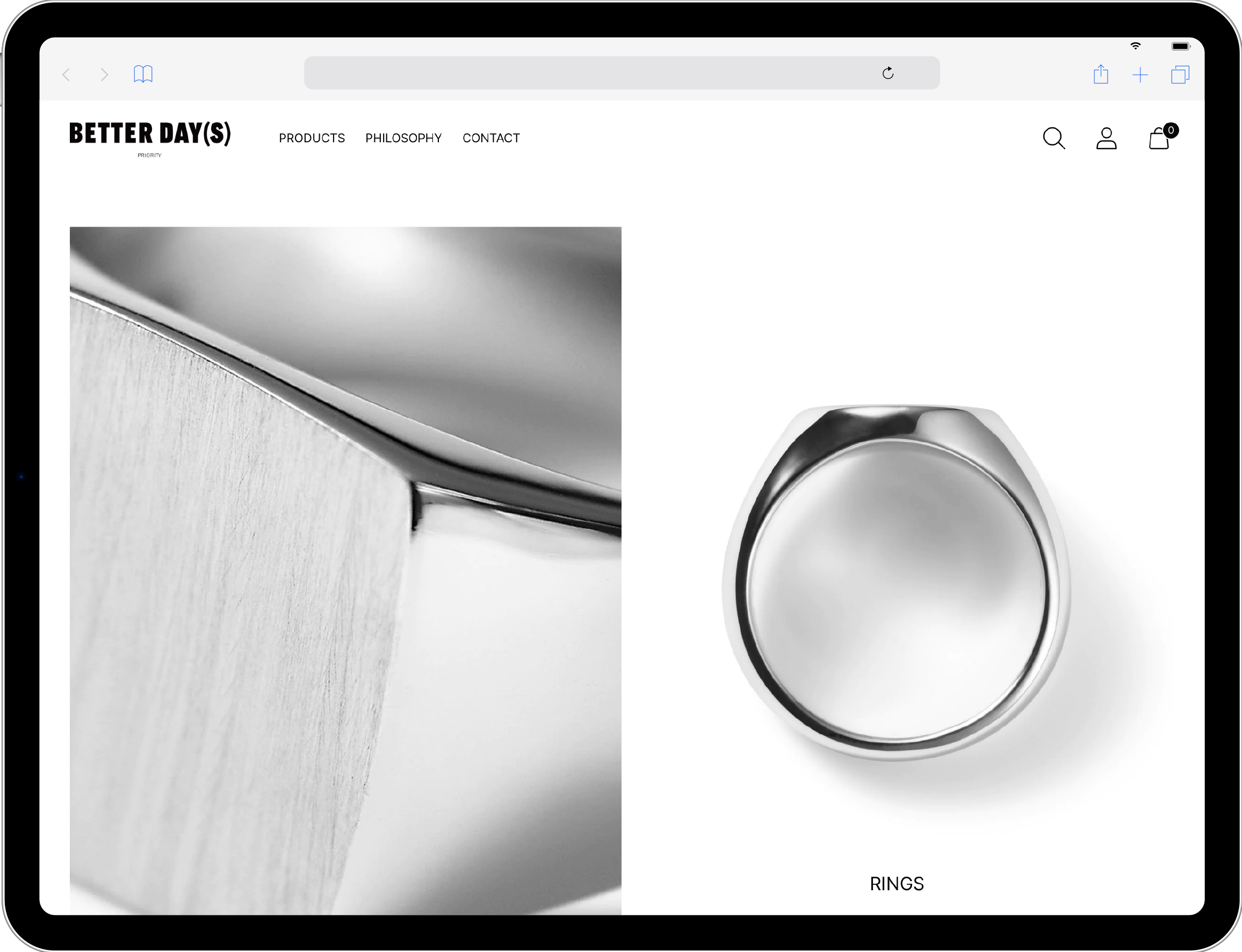
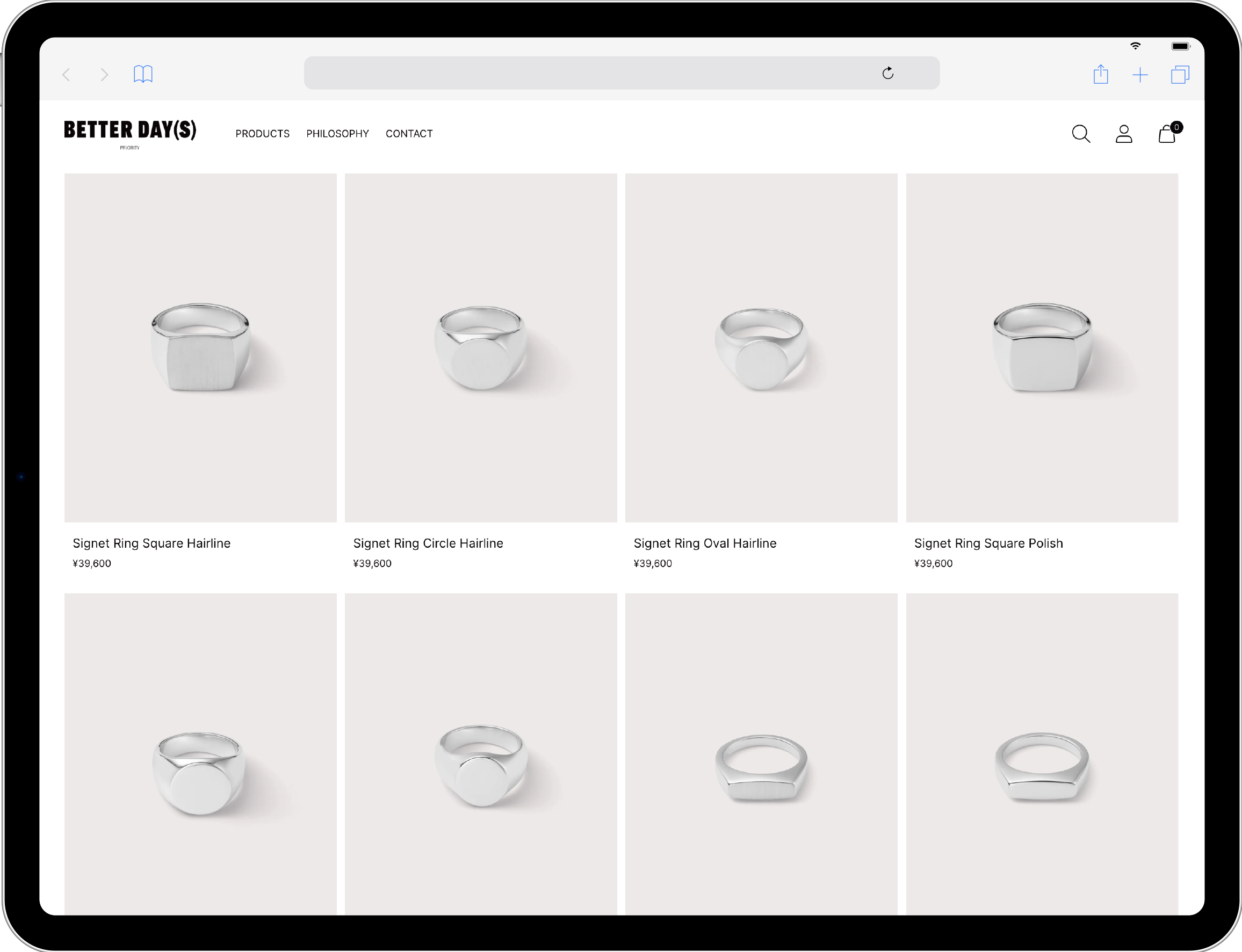
E-commerce Website
The priority for the website was to enable seamless navigation and facilitate easy purchasing, leading to the elimination of unnecessary decorations and animations. As a result, the screen becomes increasingly simple, and careful attention was given to font sizes, line spacing, presentation methods, photo sizes, and ratios. This meticulous approach adheres to the principle of "less is more." Additionally, since the products primarily consist of silver rings, the homepage is designed in monochrome, and the product photos feature a gray background, contributing to the creation of a distinctive brand aesthetic.
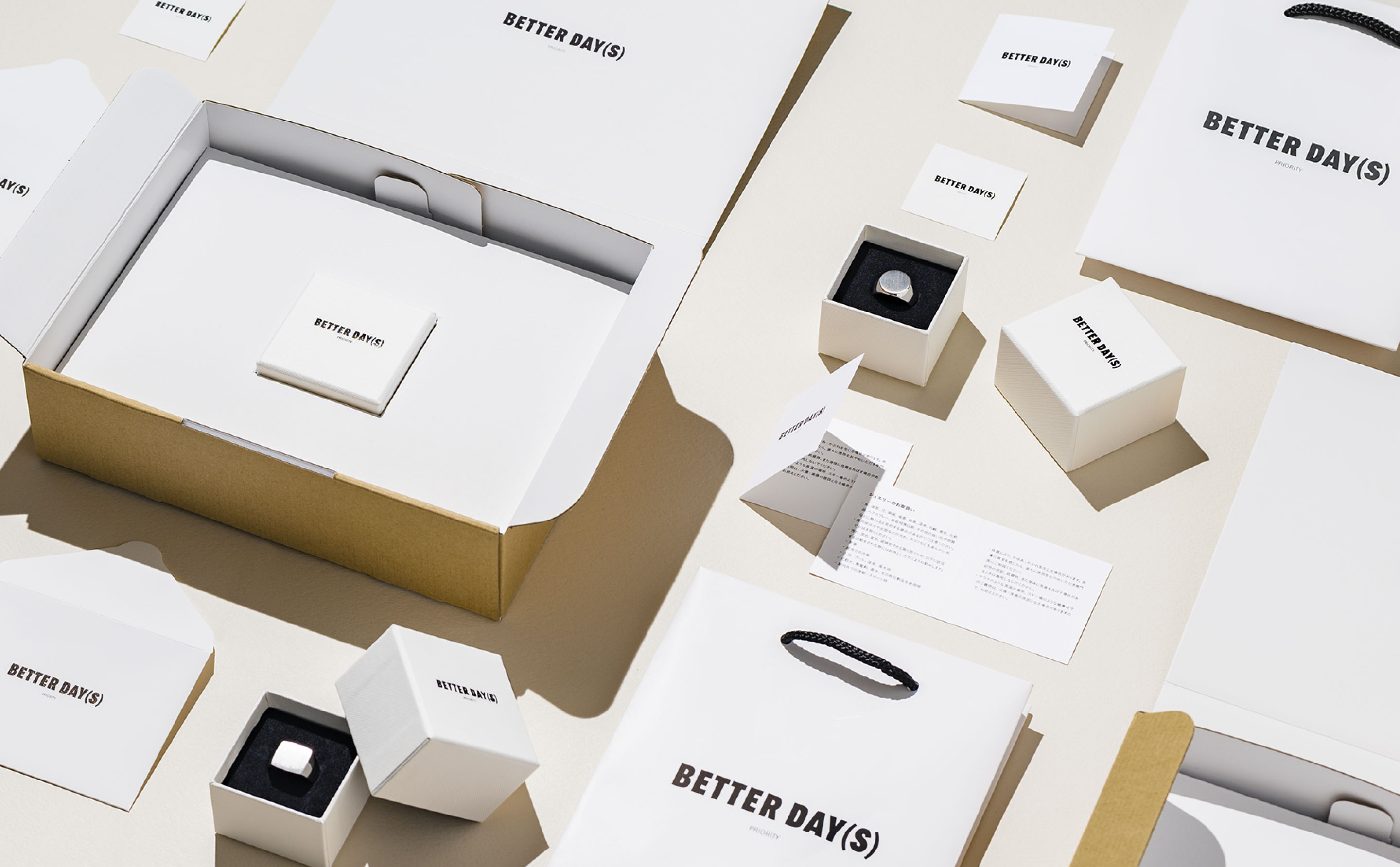
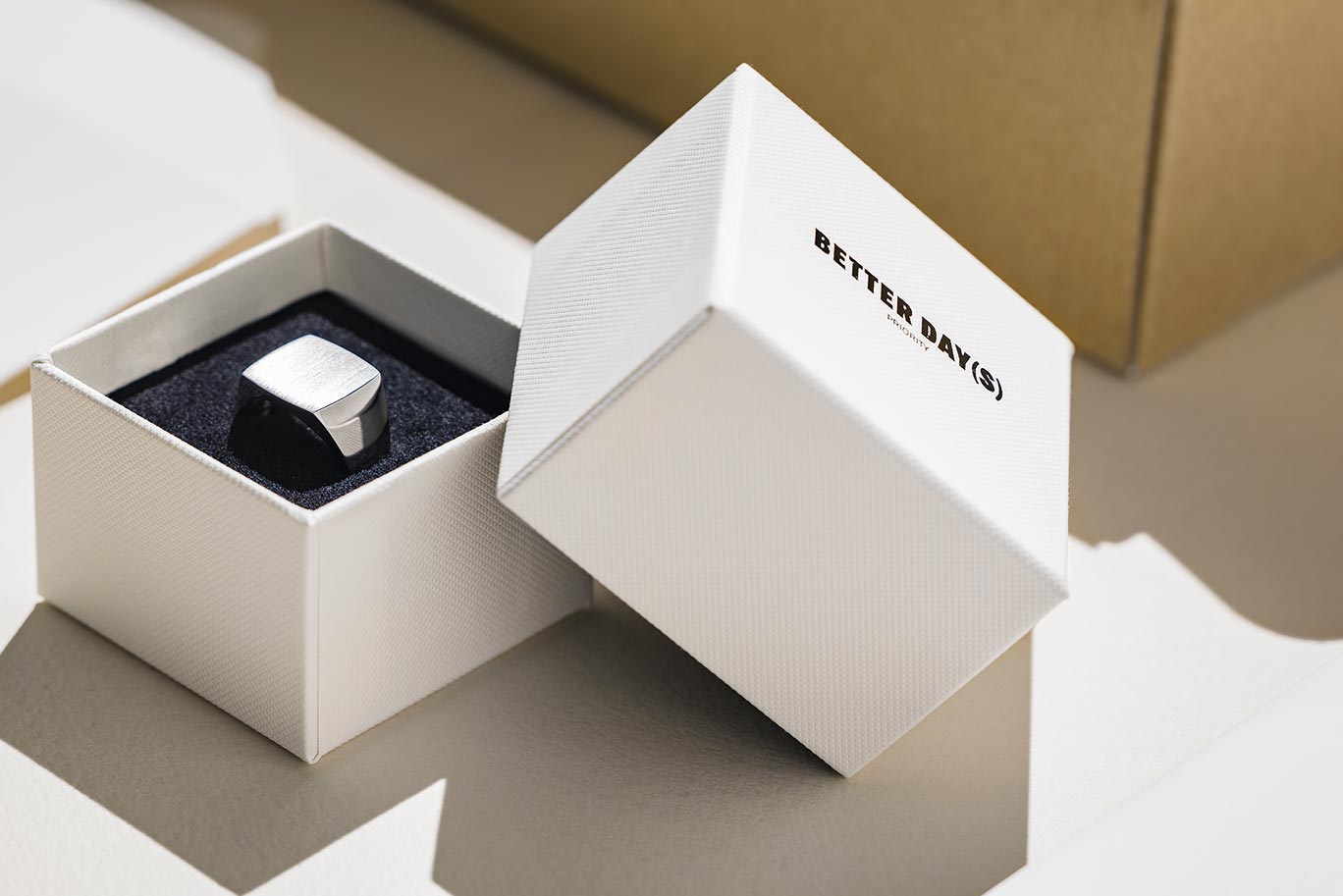
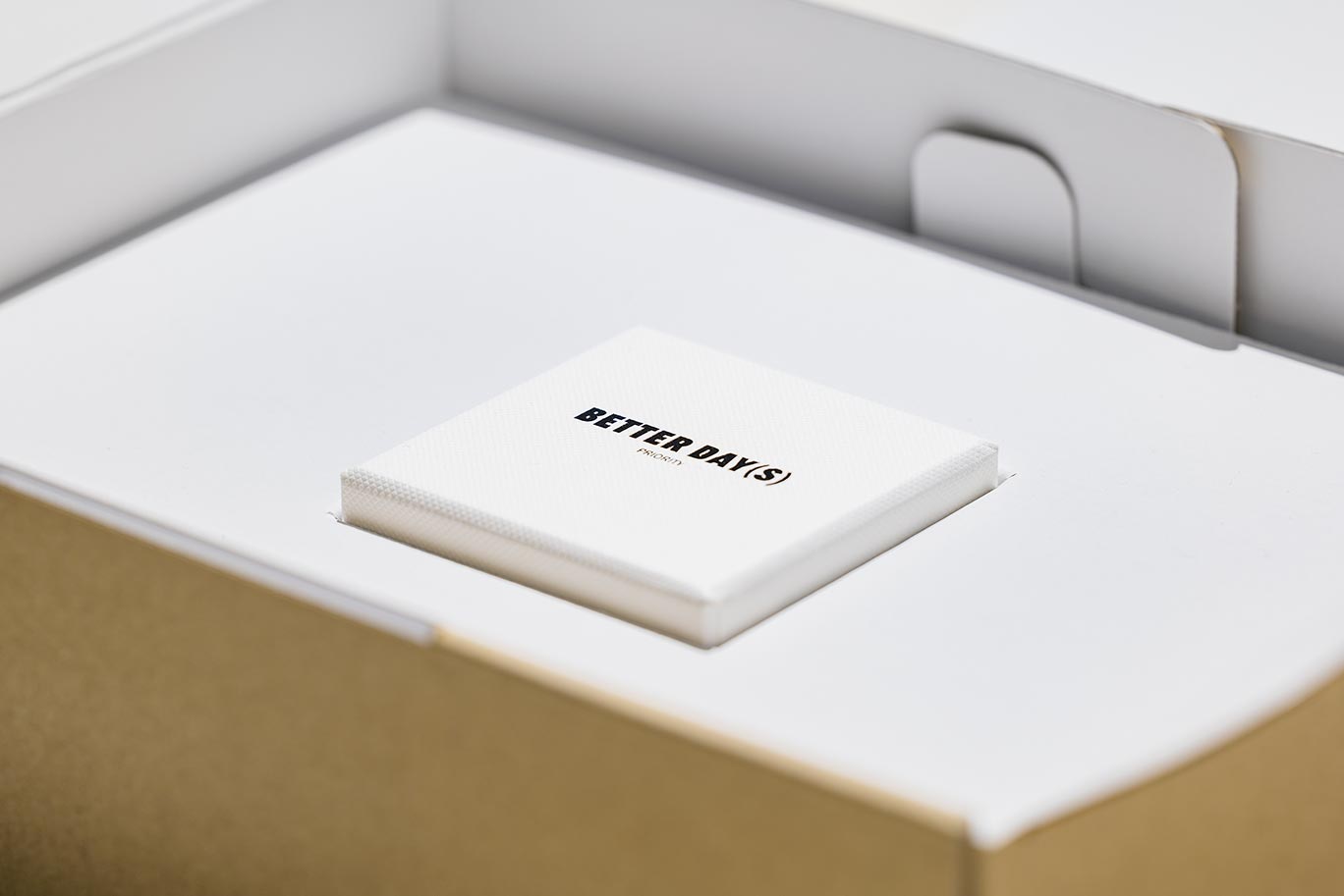
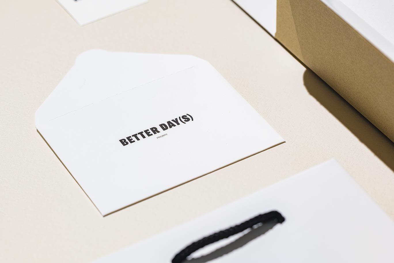
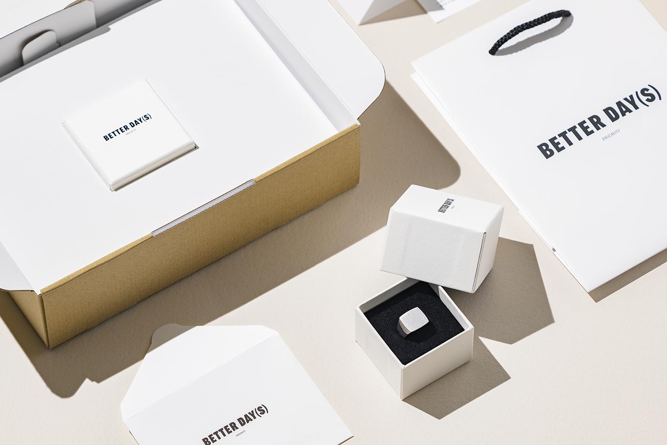
Brand Collateral
As BETTER DAY(S) PRIORITY operates solely through e-commerce without physical stores, the user experience upon receiving the purchased items was deemed crucial. The design of jewelry boxes and packaging that also serve as shipping boxes, as well as paper bags, were carefully crafted to ensure the brand's worldview permeates every detail. Adjusting the logo size accordingly across various collateral and including design elements such as jewelry care instructions for even the smallest tools, we believe this meticulous approach instills a sense of trust in the brand.
CREDITS:
Directed by ZYLA
- Art Direction and Design:
- Hiroki Fujimaki
- Creative Direction:
- Koji Yukisada
- Producer:
- Yu Katahira (Baby Tokyo)
- Photographer:
- Tomoko Yamane